Friday, January 25, 2013

Evaluation.

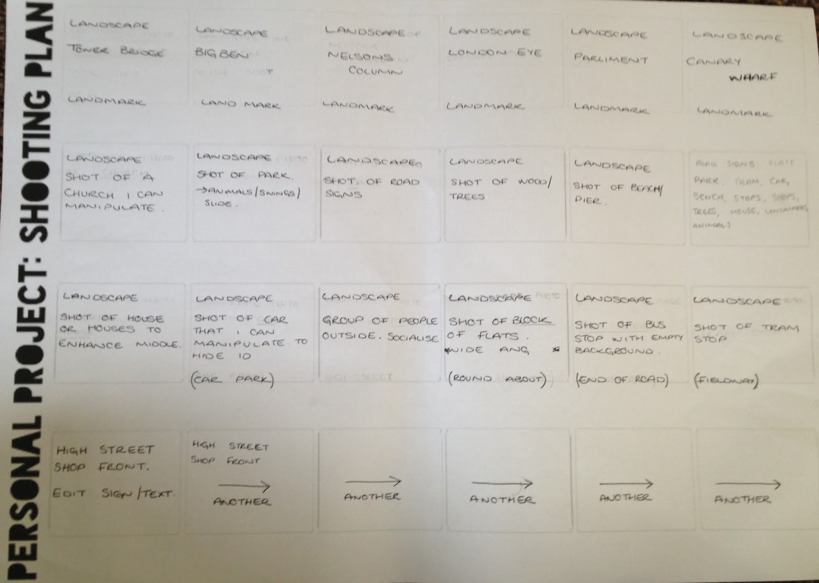
At the beginning of this project I had a couple of initial ideas. I started by planning them out and researching artist for inspiration. My main idea so inspired by Julie Cockburn. Julie starts by using both old and newly taken portraits of people and digitally enhances them to distort the face of the person so you can no longer make out who it might be. So from researching Julie Cockburn I then decided that I wanted to do something similar but instead of using people I would go on to use landscape photographs that would contain famous landmarks. I then planned to digitally enhance then landmark in the same way Julie does to the faces. I hoped this would give a great unusual effect that would let the audience/client guess where this location is.

To start this process I took both digital and film photographs as I planned on the shooting plan sheet. However instead of sticking to taking photographs of just landmarks I took photographs of famous shop fronts such as Barclays bank and Blockbusters, places that people would recognise by the colours that have been jumbled about. I also experimented a little further and took a few shots of local places that I would recognise like flats and the local youth club.

From this my idea changed as I came across the work of Quentine Jones and Genadii Berezkin. Both these artists have handmade approaches to their work which is not something I am use to doing so this really appealed to me in such a way that I was able to try something new. I firstly started by producing digital out comes inspired by Geradii but found that to get something similar it would have to be more layered and look a little less like an actual image and more of a collaged piece. I then produced a handmade outcome inspired by Quentine and I really enjoyed the way I could add a pop art twist to the piece. 

I continued to work inspired by Quentine and this lead to producing my final outcome. It consists of 3 mixed media collages photocopied in black and white and this placed upon coloured tissue paper. The coloured tissue paper contrast with black and white photocopy and allows it to stand out. This will be presented by simply mounting them onto a large piece of white card.


I think this is really effective yet as simple as it sounds the contrast between colour and black and white is what makes the piece. I think if i could start this project again I probably would change the images I used and maybe add a little more texture to the images so that you would want to touch the pieces. If i was given more time I maybe would have added fabric to some areas of the image and experimented a little more with techniques in hope that I would get a better outcome and grade.

Wednesday, January 23, 2013

Final outcome.

I started by looking at other artists and photographers for inspiration firstly I looked at Genadii Berezkin and then I came across Quentine Jone's in the process. I looked at both artists work and combined their techniques to help me produce the outcomes. 

Using the photographs I took during the project for experiments I started by cutting away sections of the photographs that I found would possibly hide some of the character or locations. 

I did this because in Gernadii's work he does the same and replaces the character with large coloured shapes as well as Quentine who adds something else that you wouldn't expect to be in the image like animals or text.


I then photocopied the image onto different coloured and textured paper. I then cut out and ripped sections of the photocopies out and stuck them onto the original image. This was great to bring new layers to a flat image. 
Also with the normal coloured photocopies I used a chemical called .... and brushed it onto sections of the back of the image and then using a coin I scratched the area of the image onto my collage image. This leaves a copy of the image printed onto the collage pieces in a faded way.

I continued to collage the image and then photocopied it so that it was black and white. I ripped and cut the excess white paper and cut shapes into the copy. I then placed the cut up photocopy onto a brightly coloured tissue paper and this still inspired by Genadii's coloured shapes, stood out tremendously on against the black and white.


I love the final outcomes. I think that the colour makes the collages complete and gives a great final touch.

Handmade experiments.

I have taken the digital images that I took during the project and started to manipulate in a way to show that I have been inspired by the work of Genadii Berezkin.

I started by cutting away sections of the image by hand that gives the main features its identity and 'personality'. Below is an example:


For the next stage I started to paint on another piece of paper in the areas where I have cut away on the photograph. I chose to use colours that are already within the image so that it wasn't too much of a dramatic change. I have added blended patches as well as block colours as Genadii has within his work. Here is my progress to the next step however I decided to show you the different photographs i've used:
(IMAGE)

This was a great experiment but i decided that it wasn't enough to get the grade i wanted to achieve. Inspired by Genadii when producing these outcomes I researched a little more for more inspiration and I now have a few more ideas for future reference.


Wednesday, January 16, 2013

Quentine Jones Analysis.

Quentin Jones is a London based illustrator who graduates from Cambridge with a Philosophy degree. She is known as one of fashions brightest filmmakers. Quentine specialises in cartoon photo montages that are known for being surreal. 
 It was down to her own modeling career that she started at an early age that has led her to experimenting and producing pieces that include the female forms.
Her work is known for the messiness and yet never fails to have a great outcome. The pop art twist in the her work is great and adds a little more colour and adds another layer to the simplicity of the female model.
It seems that Quentine used to experience negative emotions and this never failed to show in her work but as her emotions changed so did her art and soon more bright colours replaced the dark and gloomy greys and blacks.
She has recently worked with the likes of Chanel and Vogue as well as well known artist Rankin.
A big project Quentine is currently involved in, is working with Victoria Beckham. The fashion starts are talking about designs for future clothing ranges.


Julie Cockburn analysis.

Julie Cockburn is a British photograph and artist born in 1966. Julie did a foundation course at Chelsea School of Art and then went onto do a B.A at Central St. Martins. 
She has had over 10 solo exhibitions in the last 15 years and has taken part in many more group exhibitions. Julie's work has been exhibited and collected across the world and has won a selection of awards including the 2012 Salon Art Prize Award.

My reasons for researching this artist is, I found her contribution to "The 'me' My Art" exhibtion very influential. The image 'flower girl' is amazing and it is the technique I wish to use when creating my own pieces.


 I have referred to her work for inspiration a lot. I found that the hidden identity of the people in the portraits left me wanting to see the originals before she played with them and enhanced them. I will recreate this technique digitaly using Adobe Photoshop. I chose to do this digitaly as I believe it produces a better final outcome then the hand made effect.

Wednesday, January 9, 2013

Photoshop progress.

Here are the photographs I started to enhance in the last blog post but these ones are enhanced further. I was still inspired by Genadii Berezkin when creating these pieces. I think from taking away coloured areas to adding coloured shapes in other areas makes the shapes stand out against the backgrounds. 
My choice of colour for the shapes is because the colour is also within the image somewhere else. So there is a continuous theme.
Still inspired by Genadii Berezkin I think I will continue to develop experiments.


Photoshop work inspired by Genadii Berezkin.

After looking at the work of Genadii Berezkin I was inspired to create my own pieces I placed the photographs into Adobe Photoshop and added individual white shapes to take away some of the identity of the photos as well as almost hiding the location of where they was taken.
This was a very simple effect for the first step but by doing this it allowed me to experiment and find out what I might do for the next stage of development.
I have decided to add another layer again inspired by Genadii but maybe taking away more of the image and adding more colour that relates to the colour already within the image.

Below are the photographs that I have enhanced.


Digital Photographs.

These are a few digital photographs I took that I will be enhancing and experimenting with to produce a final outcome.
I have looked at the work of both Julie Cockburn as well as Genadii Berezkin.
These will both be influences when creating experiments. I chose these two artists as I love their work and think some of it is something I would enjoy trying to produce my own version of.
I will produce both digital and hand made outcomes to see which is more effective and more appealing. 
These photographs are of local areas to where I live and are locations and sites I see and travel to or past everyday.


Tuesday, January 8, 2013

Genadii Berezkin analysis.

Genadii Berezkin is well known for his surreal collages. He produces his work using clippings from news papers and magazines as well as photographs he takes himself and also adds a digital twist with the gradients of colour. 
These collages are so surreal and as you can see from his choice of composition and layout you can still make out what the collage might be of. 

Each layer is puzzled together and against the simple backgrounds the bright colour shines through. I also think his choice of shapes is reflected well in his images. The squares in the collage below almost reads as a solid structure that forms a exterior of a building.


In this second image it is sightly different to the one before, I don't think that it is as easy to interpret what the image could be forming. You can see that there is a man made building within one section of the collage but there is also natural aspects in the image like water and tree trunks. However like the last collage, the brightly coloured circles layered in the background stand out and almost add a certain feeling of surprise with the change of colour.

I really like Genadii's work and it has really influenced my ideas for my outcome. I think the exaggerated bright coloured shapes against the dullness of the cut images is what drew my attention to these pieces.


Friday, January 4, 2013

Final film mind-map.

Here is a mind-map I have produced of ideas for my final film that I will shoot in order to produce high quality photographs.

Final Film Moodboard.

Here I have produced a mood board of pieces of art that has been produced by both artists and photography that have inspired me.
The work of Quentin Jones, Julie Cockburn and Genadii Bekezkin have been included.


Progress review.


1. Which materials and techniques have you experimented with during the this project? 
During this project I have experimented with a few techniques I have used before like digital vignetting as well as adding Instagram effects digitally. I prefer the digital outcomes to the man made/dark room outcomes.

2. Have you explored and developed your ideas imaginatively? How have you demonstrated this? (give examples, link to posts or include images) 
I started by developing ideas and experimented with techniques I have used before I then started looking at other ways of experimenting and found more tutorials to use on photoshop to enhance my digital photographs further. 

3. Have you research a diverse range of photography and completed this on your blog? Who have you analysed? is you analysis in-depth? (again give examples and link to posts) 
I researched a few different photographers when i strarted this project and a couple were great for inspiration. I especially liked the work of..... 

4. Have you explored a range of ideas around your theme within your experiments? What are they? How have they informed your ideas?
My theme for this project is Landscapes. I have to show this when experimenting and progressing through this project. All my images consists of landscapes and when enhancing them I thought of ways in which I can still include the surrounding areas.

5. Have you refined / developed your outcomes through experimentation? How? 
By experimenting with ideas I found there were some I preferred to others. I really liked the hand made experiment I created inspired by..... This looked great and I figured there was another way of doing this digitally using photoshop.

6. Have you annotated, in detail, your experiments and developments on your blog and used this information to help you improve?
Some of my experiments I have uploaded onto my blog have been fully annotated and look great. As I continued with my experimentations I did more details explanations on how I created them and how others might do so as well.

7. Which techniques / experiments have been most successful? Why?
Again in my opinion my most successful experiment is the piece inspired by... (LINK). As well as the digital Instagram effect so I think I might try to develop both together. I like these two the most as it shows two completely different methods but two that might combine well together.

8. Which techniques / experiments have been least successful? Why?


9. Which techniques / experiments will you be developing further for your final outcome? Why? 
My favourite experiment was the handmade piece inspired by.... I think this will be one that I will develop further. I will created a digital attempt and maybe it will be good enough to enhance a little further and use within my final pieces.

10. What else can you do to further develop the techniques / experiments you want to use for your final outcome? 
I have looked at some of my fellow colleagues work as well as artists and  photographers and this has also influenced me in my experimenting. I found that they have done some great experiments that I had not come across before and have since tried to create my own similar pieces.

Thursday, January 3, 2013

Personal Project ideas.

I have come up with four different ideas to help me gain inspiration through out this personal project. 
Each of the sheets contains different ideas of how I might go about to create a final outcome.

For this first idea I chose to take a series of photographs that would connect together to make a scene almost like a panoramic photo. They would more then likely be photographs of landscapes as this matches my continuous theme. As inspiration I looked at a photographer called 'Rauner' for inspiration.

 My second idea I come up with taking a series of photos that would consist of reflections for this idea i was inspired by Anish Kapoor and Andre Kertesz. These are both artist that produce reflective sculptures and place in busy places where they will be appreciated.

 For my final idea my idea was to take photographs of both famous landmarks such as the London eye as well as less famous objects like bus stops and blocks of flats. I would then go on to enhance the main feature of the photograph to take away a section of the identity. For this idea I was inspired by both Greg Sand and .....

The last idea was the idea I chose to go with. This is seemed to allow me to more experimental with the final outcome and how I enhance it and exhibit the final piece.

Shooting plan

Here I have a written record of what I have chosen to shot images of over the Christmas period as part of the personal project I started. I've chosen to take photographs of these things as I believe they will have the best outcome when I have worked into them and enhanced the final outcome.


These are ideas however when creating a shooting plan you have to allow room for change as you will start to explore further with your ideas and start to produce better and more outcomes.