Sunday, June 24, 2012

Lin Osborn Crop & Composition.

I come across a photographer called Lin Osborn. Lin produces a range of graphic pieces from photographs she has taken. Here are a couple of her pieces of work.

In this image you can see that Lin has taken a photographs that change in colour so they blend across the edited image.
Here is another of Lin's images. She has taken from around London. This image doesn't change in colour but has a continuous theme based around London and things that you would relate to London.

I chose to create my own interpretation of Lin's work. I based my image on the red London telephone box. I think this image looks effective as it has a continuous theme and the red stands out in the images. However if I was to produce another graphic image like this I think I would use more of my own images rather then just a few and I might think about using a range of colours rather then just the red from the phone boxes.

Friday, June 22, 2012

Markus Kisson Cut out and Pop up.

I come across a photographer called Markus Kisson who created a project called 'Dissected Polaroids'. Below are a few images that are rather self explanatory. 


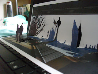
To create these images he takes photographs using a Polaroid camera. He then with the image he just took, cuts around the main feature in the image like buildings and people and folds them so they stand up off the photograph.


This is my own attempt influenced by Markus. I enjoyed this experiment and thought it as really effective as i cut around the people walking in the foreground and the buildings in the background making it more 3D. If i was to improve this I might choose to use a different image where i can cut around less obvious objects like maybe flowers.

Thursday, June 21, 2012

Norm Magnusson Painted Nature.

I looked at an artist called Norm Magnusson and his work. He creates painted nature by this I mean he collects fallen leaves, flowers, sticks and pebbles and paints them in peculiar ways using a range of colours and pattens and then goes on to photograph them creating a portfolio or work. He also photographs peoples reactions when they notice odd nature in amongst there natural surroundings.


Above are some of his pieces of work. 


I then went on to create my own work inspired by Norm. Above are two of the image of my leaf in amongst its natural surroundings. I think this looks effective as the blue and red stands out in the green foliage. However to improve next time I could paint more then one item so maybe other types of leaves or sticks and acrons as well as use different colours.


Wednesday, June 20, 2012

Jan Von Holleben Aerial Scene.

I looked at a photographer called Jan Von Holleben.
He produces life size scenes out of different materials that link to the scene he is trying to create. Jan places the materials on the floor and get people to lay within the image to help show the scene. Below are a few of his piece's of work that I really liked.


I then went on to create my own with a few of my friends. We decided that we would recreate a seaside with a person swimming away from a shark. I think that is was really effective especially as the materials we could use where restricted. To improve it next time i could create a bigger scene with more people and make a few different themes.

Typography Photoshop experiment.

To create this edited image below I started by taking a photograph that related to my chosen theme which was Landscapes. 
I found a trailer on You Tube that showed me step by step instructions on how to create a image that would end up looking similar to this.
With my photograph i imported it into Adobe Photoshop. Using the original image I did Select > Colour range > Shadows (drop down menu) > OK > cmd C > cmd V. This gave me a new layer with just the shadows from the image on it. I then did the same process Select > Colour range > Mid tones (drop down menu) > OK > cmd C > cmd V. This also gave me a new layer. I merged my two new layers so that both the mid tones and shadows were together. I deleted the original layer with just the photograph on.
I then wrote a paragraph or so of text into a word document about the image i took. In Photoshop i opened a new document, drew a text box onto the page and copy and pasted the text i had written onto the photoshop document. I then messed around with size and font style.
I then had to make the text a stamp so i could use it in the image more then once. I clicked Edit > Define brush preset. I then created a new layer and selected the brush tool and from the drop down menu I select the stamp i had just made. With this stamp i changed the size and colour and clicked in several places over the image so the text appeared randomly. You can change the size of the stamp as much as you like so there will be different marks on your image.
You then need to create a Layer Mask.  Select the text layer click the 3rd icon in the bottom right and hide the masked layer.
On layer one press cmd A > cmd C. Show the text layer again and click on the layer mask. Hold alt and click and then press cmd V.
High light the masked layer click cmd D > cmd I.
Create a new layer, drag the layer below the text layer and fill it with white from the paint bucket. This makes sure that the background if fully white.
From the drop down menu on the right you can select Gradient this allows you to add colour to your text. Select Gradient > Screen (from the drop down menu) > Blend mode > Pick a gradient > change scale > change angel. 
Finally select a soft brush tool. change the opacity to about 30pt and then brush over the text this makes some areas more detailed but you do not have to brush over the whole image.

I believe this went well and looks really effective I would like to use this in other factors of my work. I could improve it by maybe changing the colour of the image or maybe picking another image.


Tuesday, June 12, 2012

Landscape analysis.

All these images are off the V&A website.
http://www.vam.ac.uk/
 Here is my first chosen photograph related to my theme of Landscapes. I chose this image as I like how the main focus of the image, the house, reflected into the water. The reflection gives a great affect as soon as you see the image, as well as the violet sky, it almost captures your attention. As well as being a photo that can relate to the landscape theme, it could also be rather architectural if you look at the design of the house. 
Looking at this image I feel inspired to create my own in the same way if not similar but maybe using different objects like toy houses or figures in puddles rather then large house's reflected into a lake. The image makes me want to be there and experience this view for myself. A slight narrative comes from this picture almost like a wealthy family owns this house. 

 This is the second of my chosen images. I believe that this image is extremely effective and the fact there is no colour contributes to this. This image is different from the last as it is of the interior of a building rather then the exterior. I also believe that the people walking down the staircase shows the size difference between each steps and adds to my point of a great effect. The shadowing of the walls that falls onto the steps gives a darkened outlook on the image. I like the way it makes the image look really aged. This doesn't really help date the image as it can lead to misinterpretation and confusion. However it does give a sort of narrative to where the people are or why they are there.
 The staircase leads me to interpret more of the narrative as it is made from wood and the detailing in incredible.

This is the final of my choices. I chose this photograph as I like the way the images has a sepia effect but it is natural light. The sepia effect makes the image looked dated.
The fact that image was taken from the inside of the building showing what is out of the window. I also think that maybe there is a narrative behind this image about traveling. The person standing on there own looking out to the landscape around them reflects that maybe they're thinking.

V&A theme.

The theme I chose from the listed few on the V&A website that i wish to use throughout this project in a range of different ways is the architectural theme. I chose this theme as I found there was a range of ways you could go about using this titled theme. 
I could look at both old and modern shaped buildings and the similarities and differences. I could look at the people that work inside these buildings. I could also consider looking at different buildings all over the world and how different countries build things differently.
I believe this will be a good theme to photograph because everywhere you go and look there is a different built or structured things from floors to ceilings and most of the things in between.
There are lots of photographers from all around that world that use this theme as inspiration for there work. I have previously looked at a photographer called Anthony Weller who produces phenomenal photographs of buildings and everything that accompanies them like the people and the interiors.